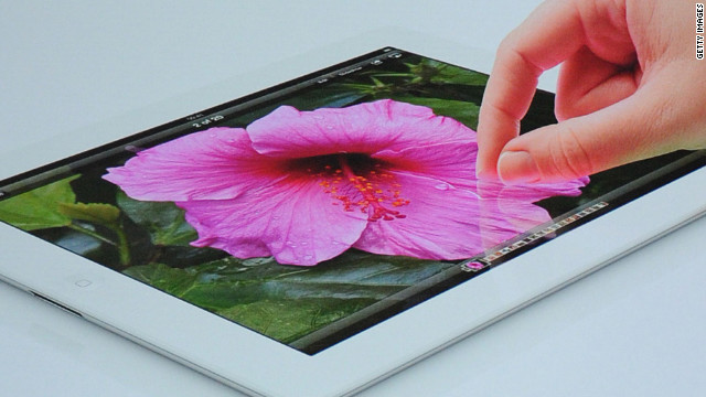
Why do magazines look so bad on the new iPad?
Source: Lauren Indvik
 As with any high-profile product release, Apple's new iPad device has been peppered with complaints since reaching consumers' hands on March 16. Among them: that magazines look terrible on the iPad 3′s high-resolution display.
The complaints were first brought to light by Tumblr blogger Jamie Billett. He pointed out that in the New Yorker's iPad app, the text on some pages is rendered as HTML, and the text on other pages is rendered as an image (.png) file.
The latter pages now appear "badly aliased" -- i.e. conspicuously pixelated -- throughout the app because the images haven't been formatted to accommodate the iPad 3′s 2048 x 1536-pixel resolution, he complains. (The iPad 2, by comparison, has a resolution of 1024 x 768 pixels.)
The New Yorker and other Conde Nast title have taken the heat for looking poor under the new display, but they're not alone. Titles from other magazine publishers -- we looked at Time magazine and Sports Illustrated from Time Inc., and at Esquire and O: The Oprah Magazine from Hearst -- all suffered from the same problems.
The only exception? Vogue, which launched its iPad edition the same day the iPad 3 hit stores. The title planned its debut in conjunction with the tablet's release, and thus was able to optimize for the iPad's "retina display" ahead of time, a Conde Nast spokesperson told us.
The spokesperson added that the company is "working to optimize the rest of our digital edition portfolio over the next few weeks."
But what will the 'optimization' process entail? How much will it increase file sizes? (We noticed, for instance, that Vogue's premiere issue was a full 408 megabytes on the iPad 3, and less than 300 on the iPad 2.)
We spoke with Zeke Koch, senior director of product management of Adobe's digital publishing arm, to find out. Adobe's software powers all of Conde Nast's editions for tablets.
Magazine publishers who use Adobe's software all begin with InDesign to develop layouts, Koch explained. Those layouts can then be exported in three different kinds of formats: as images (.png or .jpg), PDF or HTML.
Different kinds of files -- images, for instance, or video and audio files -- are embedded within those larger file types.
Since magazines began publishing on tablets, "virtually all" publishers have chosen to export their digital editions as PNG (.png) files, Koch said. "The primary reason they did that is because the fidelity is perfect.
What you see on the desktop when you're designing is exactly what you see on the iPad when you're finished. Images are the fastest thing to load, and if you're trying to create a quick, effortless browsing experience, images are the way to do that," he explained.
"That was okay when there was only one screen size -- when you were just working with the iPad 1 and 2," he added. "When the iPad 3 came out, you were now dealing with a device with four times as many pixels."
The iPad 3 applies an anti-aliasing filter to all low-resolution content, which blurs images ever so slightly. As a result, photographs still look about the same on the iPad 3, but the text looks a lot worse -- i.e., visibly blurry, or pixelated.
What Vogue did -- and what all other titles will have to do in the coming weeks -- is begin exporting their digital editions as PDFs, said Koch.
But what about file size? I pointed out to Koch that Vogue was nearly as large as Wired's first issue for the original iPad. Unfortunately, he said, magazine files will be larger for iPad 3 readers because the image and video files need to be delivered at a higher resolution.
Owners of first and second-generation iPads will still be able to download smaller, lower-resolution files, however. A magazine that is around 400 megabytes on the iPad 3 will be around 280 megabytes on the iPad 1 and 2, Koch said.
But why not render in HTML? I asked Koch. Wouldn't that make the files smaller, and give readers the added benefit of selectable text?
Koch claimed that publishing in HTML wouldn't substantially reduce the file sizes. "In both cases, you have a bunch of words, and descriptions of where things should be, and multimedia. Those multimedia files are still the same size."
He said the big disadvantage with HTML is that it's "not very good at layout out things predictably and perfectly." Rather, it's optimal for helping people create content that will adapt to any size screen.
Ultimately, however, Koch believes most publishers will move to HTML as standards improve and as publishers move to publish on a wider range of tablets.
So there you have it. Magazine readers need not despair about the appearances of their magazines for too much longer, as publishers are working to optimize their editions. The fix is relatively simple: publishers will have to increase the resolution of their image and video files, and export their digital editions as PDFs.
iPad 3 owners will have to suffer longer download times, and won't be able to store as many magazines on their devices as iPad 1 and 2 owners, but that's the price one pays for a visually stunning reading experience, no?
| }
|